



12 Years of History, Bound into a Single BookLooking Back on the Production of Document of Ginza Sony Park Project (Part 2)
Aug 25, 2026
Integrating Built-Up Tacit Knowledge with Philosophy
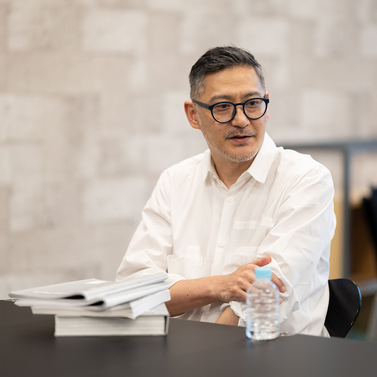
Nagano: It was you who said we should ask Mr. Irobe to handle the design, wasn't it, Soken?
Ito: I felt like Mr. Irobe was the only one who could truly understand Ginza Sony Park's approach to expression and translate it into a consistent design. Above all, he'd already handled the graphic design for "Sony Park Exhibition," which was both the final program at Ginza Sony Park <Version flat> and the opening program for the current Ginza Sony Park.
Nagano: Looking at the studies from your team side by side like this, the design barely changed at all from the first proposal.
Ito: I got the sense that you already had the finished design in mind from our very first meeting, Mr. Irobe. We gave you the overview, and you just said, "Got it." You barely asked any questions.
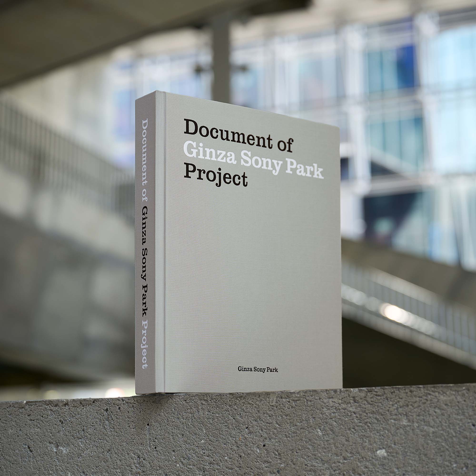
Irobe: When you first spoke to me about the project, the title Document of Ginza Sony Park Project was more or less decided. But this wasn't a conventional architectural monograph, a company history, or a corporate brand book. The idea that this was a "book documenting the project" definitely gave me a direction for the design.
Ito: We saw Ginza Sony Park as one continuous story stretching back to the Sony Building in 1966. So it felt more appropriate to have "Ginza Sony Park Project" in the title, rather than just "Ginza Sony Park."
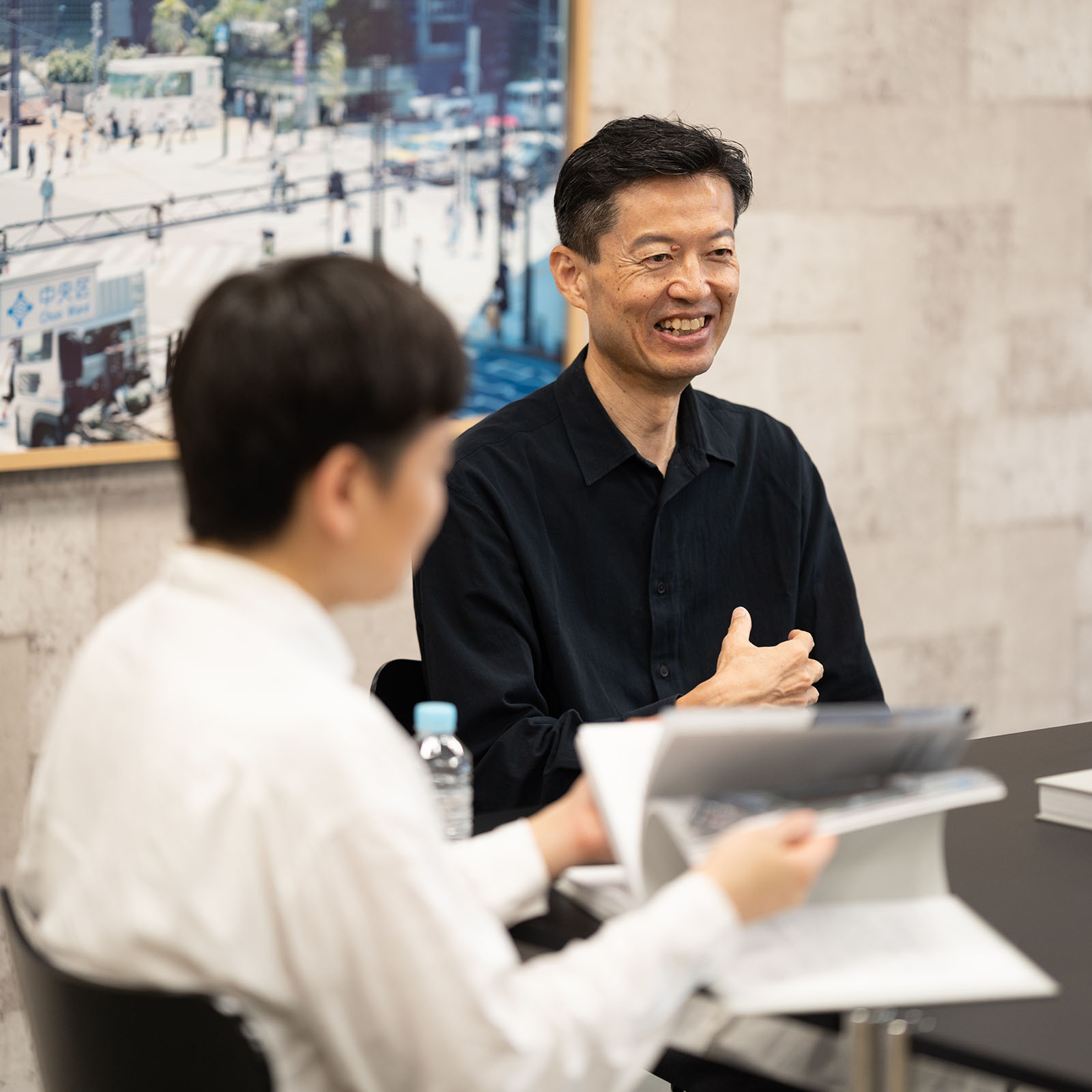
Nagano: From what the two of you have said, I feel like the process of making the book mirrors the process behind the Ginza Sony Park Project itself. At the heart of Ginza Sony Park is Sony's identity of "being unique." The project's design team translated that into the architecture, while the activity team developed it into experiences.
The same is true of Document of Ginza Sony Park Project. The core of it is the Sony identity, and the two of you translated it into physical form as a book. I think you were able to integrate the founder's and architect's philosophy with the tacit knowledge you had built up over your years working with us on this project-your understanding of what Sony is, and what Ginza Sony Park is.
Ito: I think the Ginza Sony Park team choosing this book design gave the editorial team an extra push. We felt we still had to do more to live up to the design. It was a great moment when the design outpaced the editorial work.
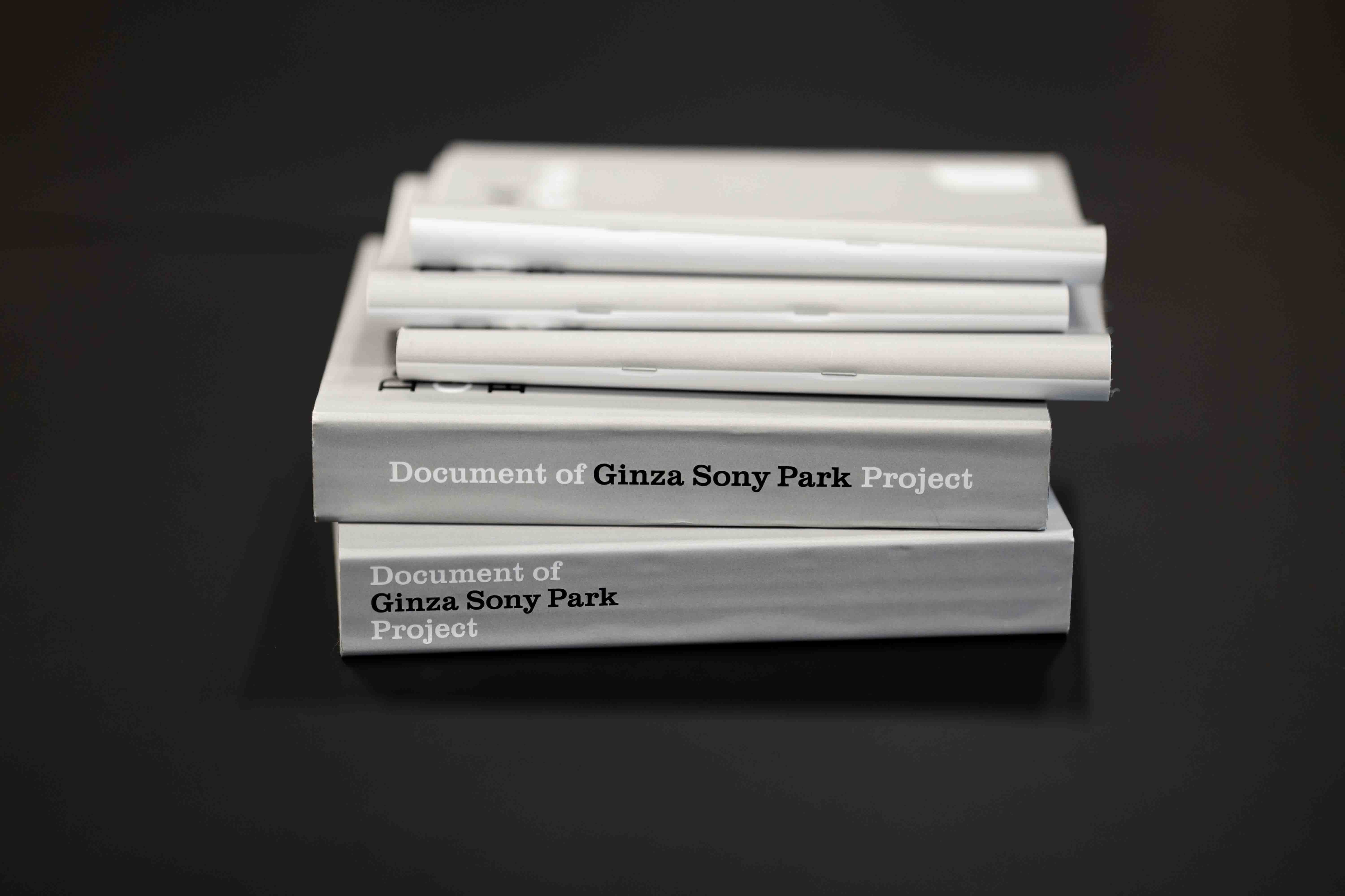
Nagano: Seeing the proposal for the book design gave me a clear idea of what the finished book would be. Even the concept of a book that could stand on its own like a building was spot-on.
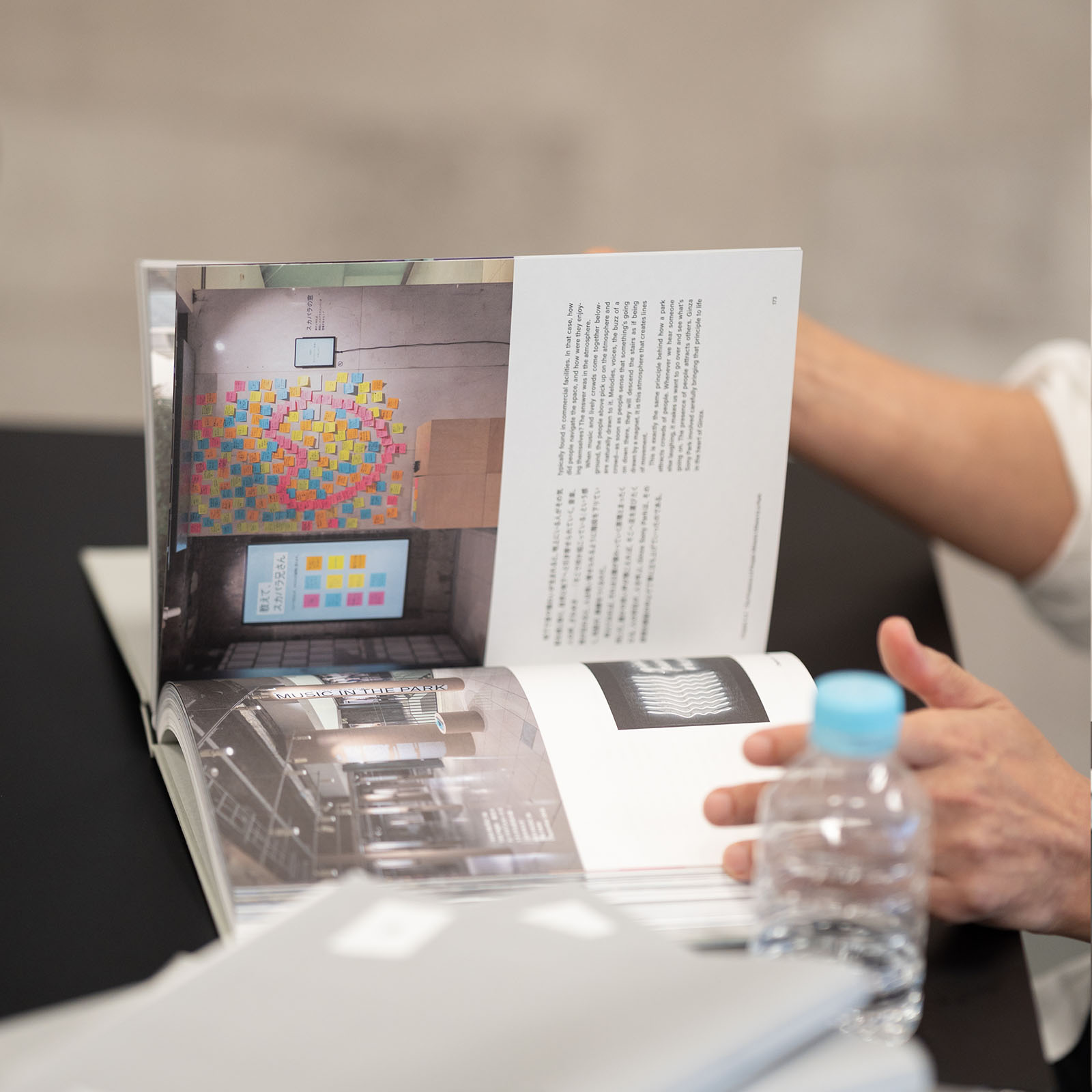
Irobe: A tremendous amount has gone into this project over the years-the time spent, the people involved, and the number of activities that have been planned. I had an instinctive sense that if this single book were to capture the full scope of the project, it would need to be about this thick. And given the building's Brutalist character, a thin, sleek, refined book wouldn't have felt very Ginza Sony Park anyway.

Ito: The "Ginza Sony Park"-ness also comes through in the choice of typefaces. The main text in the chapters is set in a Gothic typeface, while the columns that capture particular moments are in Mincho. How did you arrive at that combination?
Irobe: The energy of the content and the boldness of the architecture had really made an impression over the course of the Ginza Sony Park Project. With that in mind, we chose a bold Gothic typeface with a strong, dark presence for the main text. We also researched the typefaces Ginza Sony Park had used in the past, and tried a number of different combinations before arriving at the proposal.
We actually experimented with quite a few different layouts too. With roughly equal amounts of text and images, we had to figure out what kind of format would allow it to work both as a visual experience and as a reading experience. The amount of text and the types of visuals also vary from chapter to chapter, with the visuals ranging from archival and newly commissioned photos to drawings and data. Finding a way to tie all of those different elements together into a cohesive book was a real challenge, and we worked to find the best solution through discussions with Mr. Nagano.
Nagano: At one point, I felt the bold type in the main text looked a little heavy, so I mentioned it to you. You immediately reassured me that it would look more balanced when it was printed.
Irobe: I remember. We'd chosen paper that didn't have the surface treatment normally used to improve printability. The paper absorbs some of the ink, so the colors come out a bit more subdued. We could, of course, have used paper with surface treatment-the kind normally used in photo books, where accurate image reproduction is the priority and the coating keeps the ink from soaking in. But for a book like this, which brings together such varied information in this deliberately rough way, it didn't feel right to use paper designed for reproduction. I relied on experience to judge how the ink would sink into the paper and affect the final appearance.
Nagano: That was another moment when I felt the process was similar to the design process for the project. For the concrete at Ginza Sony Park, we used ordinary formwork, a method that introduces a certain amount of unpredictability and can't be completely controlled. But Nobuo Araki, one of the design team members, knew exactly how far to take the finish while still preserving that raw texture. That came from experience. In the end, it turned out wonderfully, just like this book. It reminded me once again that there are some things best entrusted to trusted collaborators with whom you've built an ongoing dialogue.
Interpreting History and Passing It On to the Next Generation
Ito: Reading the book again now, those 12 years feel almost like a memory of "that hot summer day." The project was also affected by the COVID-19 pandemic along the way, and the book can be read as a single story that reflects the spirit of the times.
Irobe: While I did work on the project for some time, I wasn't involved for as long as Soken. So as I worked on the design, I was also still exploring what direction the book should take. I gradually found the answer through my discussions with Mr. Nagano. This book also shows that the Ginza Sony Park Project began as a response to the ideas of Mr. Morita and Mr. Ashihara, and that the building itself took shape as a response to the city and the people in it. Seen in that light, Document of Ginza Sony Park Project began to feel almost like a collection of "responses."
Nagano: In 1966, the Sony Building was seen as a "showroom building." But by studying the records left by Mr. Morita and Mr. Ashihara, we rediscovered its value as a building with an "open-to-the-city " spirit, and chose to carry that forward into Ginza Sony Park. This book is something to pass on to the next generation. We carefully engaged with the intentions and aspirations of Mr. Morita and Mr. Ashihara, deciding what to preserve and what to communicate, and documented it all with a real sense of responsibility. In that sense, perhaps this book is kind of like a grand handover document.
Ito: For the people who work on Ginza Sony Park in the future, this book might feel like a bit of pressure- like, "I'm the one who has to write the next page."
Nagano: A park is a place that's always changing as it embraces diverse people and different eras. Just as our team had something we could return to and rely on, we wanted to leave behind something that could serve as a point of reference for those who engage with this place in the next era. And underlying it all is our hope that Sony's identity of "being unique" will continue to live on in this place.
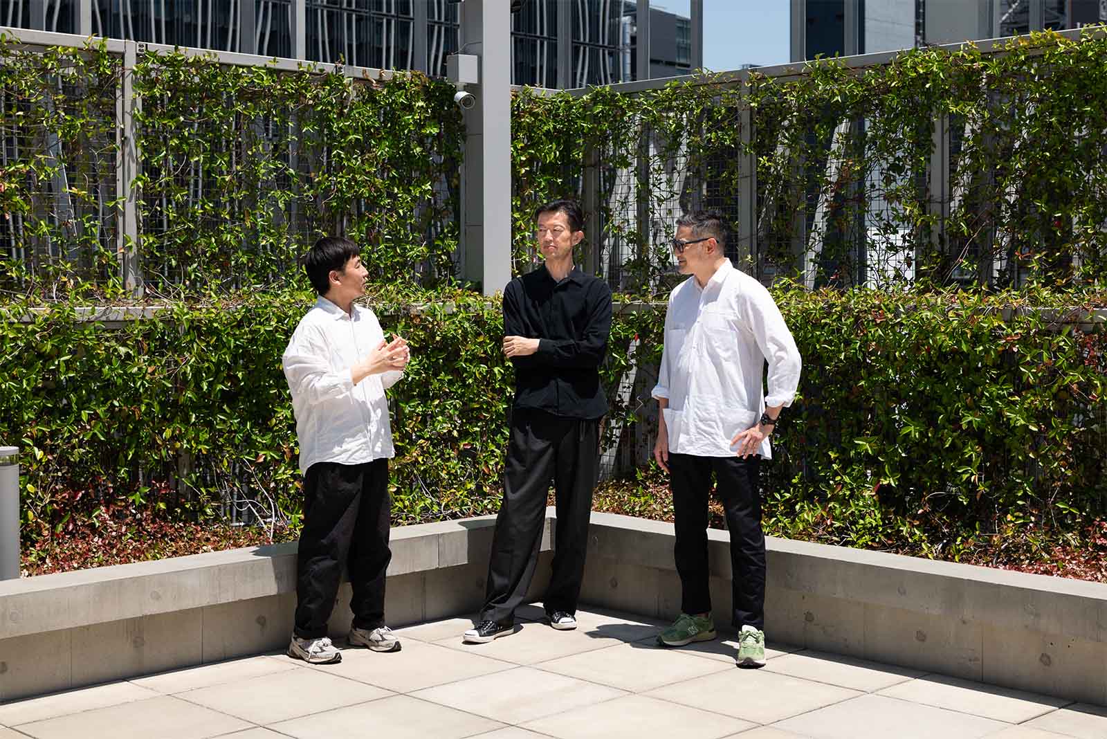
Profile
- Soken Ito / Editor & Planner
- Born in Fukuoka Prefecture in 1974. Works across a wide range of fields, from ad campaign production to corporate branding, planning and editing for magazines and books, and video and web production. Joined the Ginza Sony Park Project in 2013. Handled planning and editing for this book.
- Yoshiaki Irobe / Art Director & Designer
- Born in Chiba Prefecture in 1974. Heads the Irobe Design Institute at Nippon Design Center, Inc. With a primary focus on graphic design, he works in a range of design disciplines, spanning 2D, 3D, and spatial environments. Handled art direction for the "Sony Park Exhibition" in 2021. Worked on book design for this publication.
- Daisuke Nagano / Leader, Ginza Sony Park Project | President & Representative Director, Sony Enterprise Co., Ltd.
- Joined Sony Corporation in 1992. After gaining experience across sales, marketing, corporate strategy, and the CEO Office, he began leading the Ginza Sony Park Project in 2013. Assumed his current position in 2017 and oversaw the grand opening of the current Ginza Sony Park in 2025.